
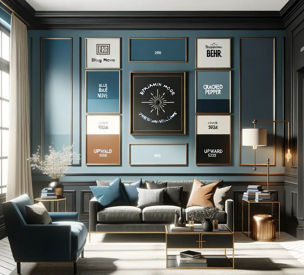
It is always a good time to look at how color therapy helps when choosing paint colors for your home. What is color therapy? At its simplest, color therapy is choosing colors based upon the physical and emotional response evoked by that color. As Lisa Byrne explains in her article Color Me Happy:
being in a red room will increase your heart rate and stimulate chemicals associated with aggression and high energy, while the color yellow stimulates serotonin (the feel-good chemical) in our brains.
In other words, the colors that you use to decorate your house can have an impact on everyone who lives in and visits your home. By understanding the attributes of each color, you can select the right color to enhance the atmosphere and purpose of each room.
The Color Red
Red is associated with energy, warmth, passion, and danger. It stimulates the appetite, which makes it a good choice for dining rooms. However, too much red can be overstimulating, leading to headaches and inviting hostility or aggression.
A Sunny Yellow
Yellow is associated with sunshine, brightness, and optimism. It promotes creative thinking, making it a good choice for kitchens. The sunny aspect also makes it great for north-facing rooms. However, that same brightness makes it a poor choice for bedrooms, and too much can increase irritability and hyperactivity.
Green for Renewal
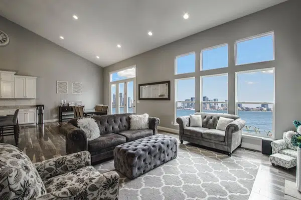
Green is associated with nature, renewal, and balance. It offers a calming influence, making it a good choice for bedrooms and living rooms. However, too much green can be too calming, making inhabitants complacent and suppressing initiative.
Blue is Calming
Blue is associated with serenity, calmness, and rest and is thought to promote sleep and prevent nightmares. This color makes it a good choice for bedrooms. However, too much blue can feel cold and unwelcoming.
Color Me Happy
For more information about these and additional colors, check out Color Me Happy by Lisa Byrne or Psychology of Colour by the BBC. One last piece of advice. While these colors generally impact people as discussed, not everyone will respond in the same way. Lisa Byrne suggests a personal color assessment. Grab a paper and pen and write the name of each color on a piece of paper. Fill the page with whatever comes to mind when you think of that color. Don’t self-edit. Just jot down your thoughts, stream-of-consciousness style. The results will help identify which colors you (and your family) are personally drawn to — or resistant of.
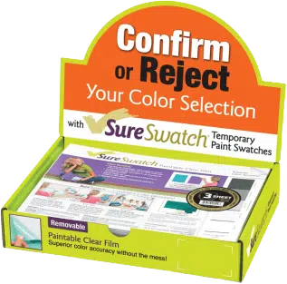
And when you’re ready to put your new color knowledge to use, SureSwatch offers a convenient way to try the colors at home. The paintable and removable clear, plastic sheets can be purchased online or at the paint counter in Home Depot. Contact us to learn more.
